How to Choose the Right Shade of White (and the Whites We Used in 2021!)
Who doesn’t love a white kitchen? Ok, maybe not everyone, but while some may find them boring, a white kitchen is a classic beauty that will probably always be a favourite for many people. Not only are white kitchens loved, but many people are loving white walls throughout their homes these days. It provides a fresh and modern backdrop for a minimalist style to pop. And of course, it works for other design styles too
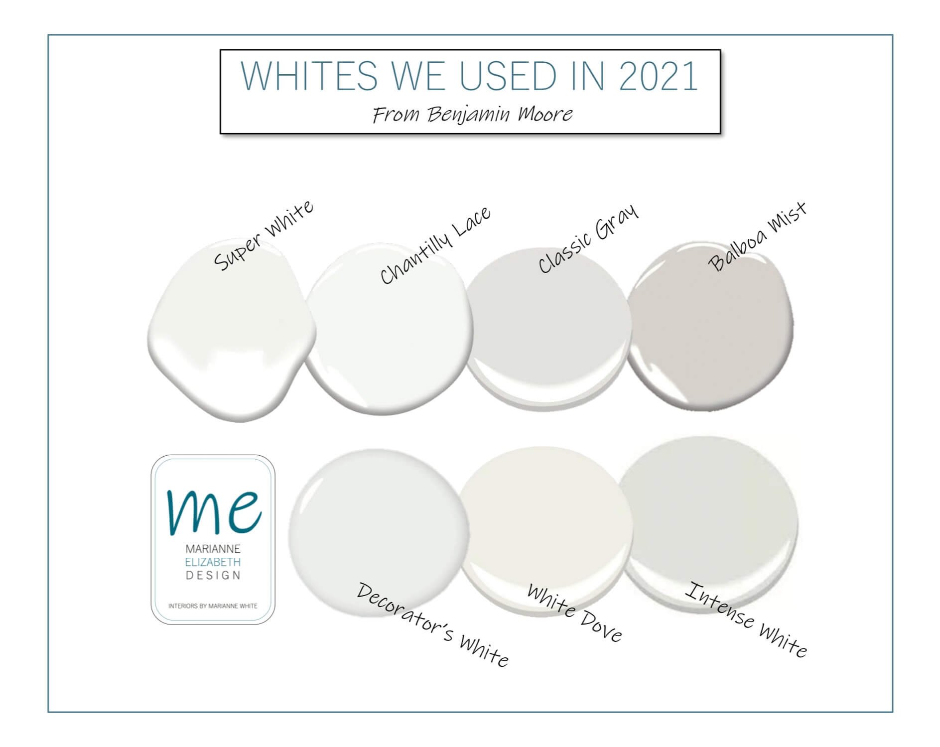
White often finds its way into a lot of our projects, if not on the walls then often on the trim and the ceiling. Here are our most used Benjamin Moore whites and a quick description of what they look like:
Chantilly Lace- A bright, but soft, white that leans slightly to the warmer side, especially when compared to other true whites.
White Dove- A versatile white that can look either cool or warm depending on the available lighting.
Super White- A bright fresh white that looks clean and modern with minimal undertones.
Decorator’s White- A cool white with cool undertones, and looks more grey than other whites.
Intense White- Not so fitting to its name, this “white” is more of a very very light greige that reads like a very light, slightly warm grey.
Balboa Mist- This off-white is almost like a very light greige. It has some warmth, but not too much, and has a lot of depth.
Classic Gray- Is a very light gray with some warmer undertones to it. It can read as more of an off-white in a bright room!
In the photo below from our Ridgebrook Kitchen Renovation, Super White was used for the upper cabinets, and Chantilly Lace was used on the ceiling. You can see how they gave the space a fresh, modern look.

Ridgebrook Kitchen Renovation by Marianne Elizabeth Design
In this next photo below from our Coopers Renovation, the walls are Intense White and the upper cabinets are Decorator's White. You can see how the Intense White has more of a slightly warm greige look to it!

Coopers Renovation by Marianne Elizabeth Design
Below is another example showcasing Chantilly Lace on the ceiling. In this project, it was important that the style had a warmth to it, so Chantilly Lace was a perfect choice. The cabinets here are in the lovely Balboa Mist. You can see how the colour looks different depending on the light hitting it. The walls here are in Classic Gray, and are a good example of how bright natural light makes this colour more of a versatile off-white.

Tuscany Kitchen Renovation by Marianne Elizabeth Design
If you're hoping to use white in your home, here are our best tips on how you would choose the best one:
Get samples & test them in different areas of the home.
Make sure to get a sample can or large swatches that you can test on different walls and different rooms of the house. The colour will look different in different areas!
Look at the colour at different times of day.
Yes, even the time of day will change how the colour looks too! Often during the sunny afternoon, the colour will take on a slightly warmer tone than it would in the mornings or in the winter when the sun may be coming in from a different angle. The changing amount of light the room receives throughout the day will also make the colour look brighter or darker.
Determine the undertones.
In general, shades of white will fall under two categories: warm whites and cool whites. Warm whites will have undertones of yellow, pink, or beige, while cool whites will have undertones of blue, purple, green, or grey. These undertones may clash with other colours in your home, or bring out colours that you don’t like.
Compare the paint swatches to a bright white piece of paper.
If you’re having trouble seeing the undertones of the colour swatches, this will help. A white that you thought was a bright white but was actually a warm white, will look a bit yellow compared to the white piece of paper. The same goes for a blueish white or pinkish white- comparing them to a bright white piece of paper helps to see the undertones.
Check it with other finishes in the home.
Make sure your paint samples look good with all the other finishes in your home- flooring, tile, cabinets, etc. These will pull different undertones.
Choose the wall colour last.
If applicable to your situation, choose your paint colours last, after all the other finishes. This is because there are more paint colour options than there are flooring options, tile options, etc. This way you’ll be able to choose the perfect wall colour no matter what your other finishes are! This also makes it much easier to narrow down the right shades because your finishes will pull certain undertones, and there are hundreds of paint colours.
And as always, we are here to help if you need more professional guidance on choosing the perfect white for your home (or any other colour). We know that choosing paint colours is one of the most challenging aspects of home design! You can read more about our design services here.