
Choosing a paint colour isn't always easy, especially when you're considering something a little darker than the usual neutrals. Deep greens, rich blues, warm browns, and earthy golds can bring warmth, depth, and character to a room, often in ways that lighter shades can't.
And while dark paint colours can seem like a bold choice, they can work beautifully in everything from a small powder room to a spacious living area. We've rounded up six Benjamin Moore paint colours we love, each offering a different way to bring a little more richness and personality into your home.
Hale Navy HC-154 — Benjamin Moore
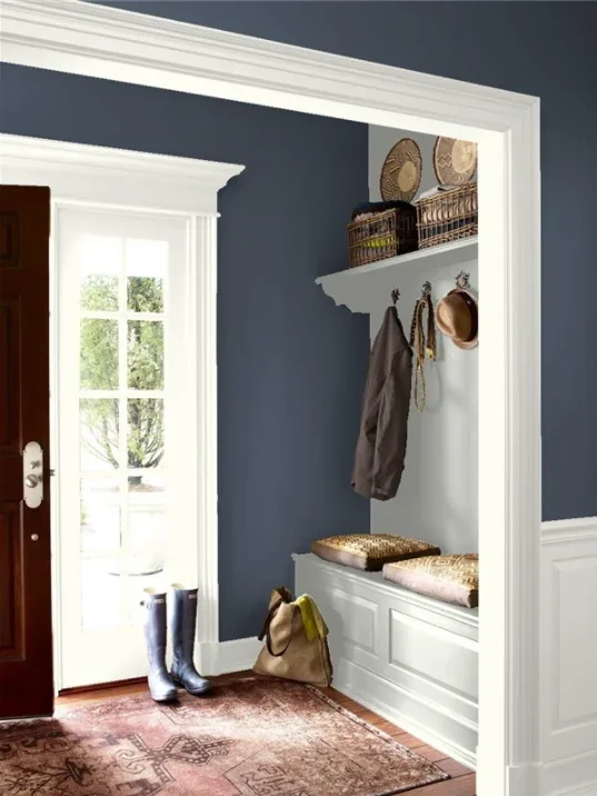
There's a reason deep navy never seems to go out of style. Hale Navy is a rich, classic blue that brings depth to a room without feeling quite as dramatic as black.
Credit: Benjamin Moore
It looks beautiful in home offices, bedrooms, and living rooms, particularly alongside warm wood, brass accents, and creamy whites. It's also a lovely choice for cabinetry if you're not quite ready to commit to dark walls.
Tarrytown Green HC-134 — Benjamin Moore
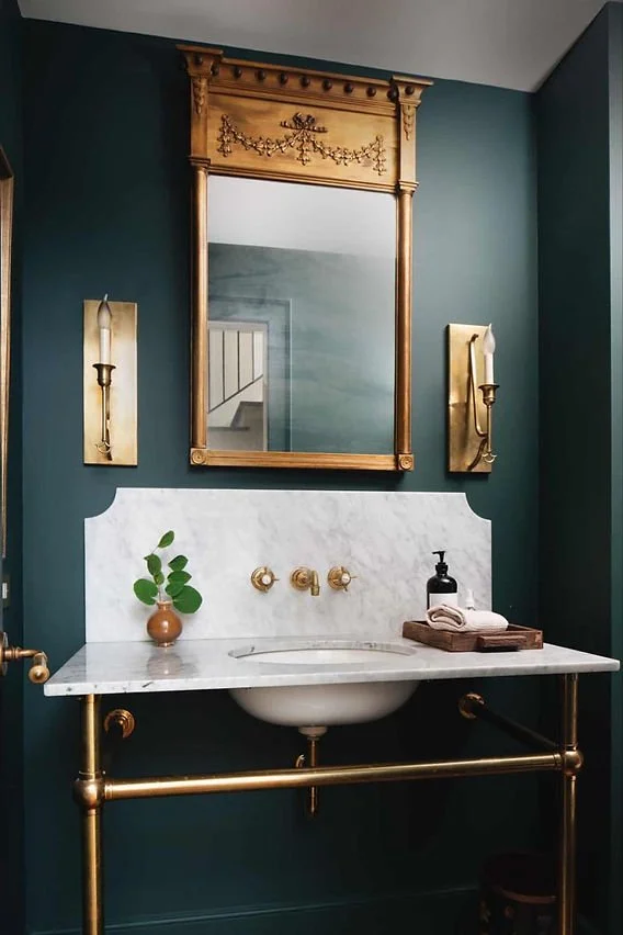
If you love the look of traditional interiors with a little character, Tarrytown Green is worth a look. This deep green has a classic, heritage feel that works particularly well with antique furniture, natural wood, and warm neutral fabrics.
Credit: Karolina De Costa
Think cozy libraries, dining rooms, or an entryway with beautiful architectural details. It's the kind of green that feels right at home in both older houses and more contemporary spaces.
Raccoon Fur 2126-20 — Benjamin Moore
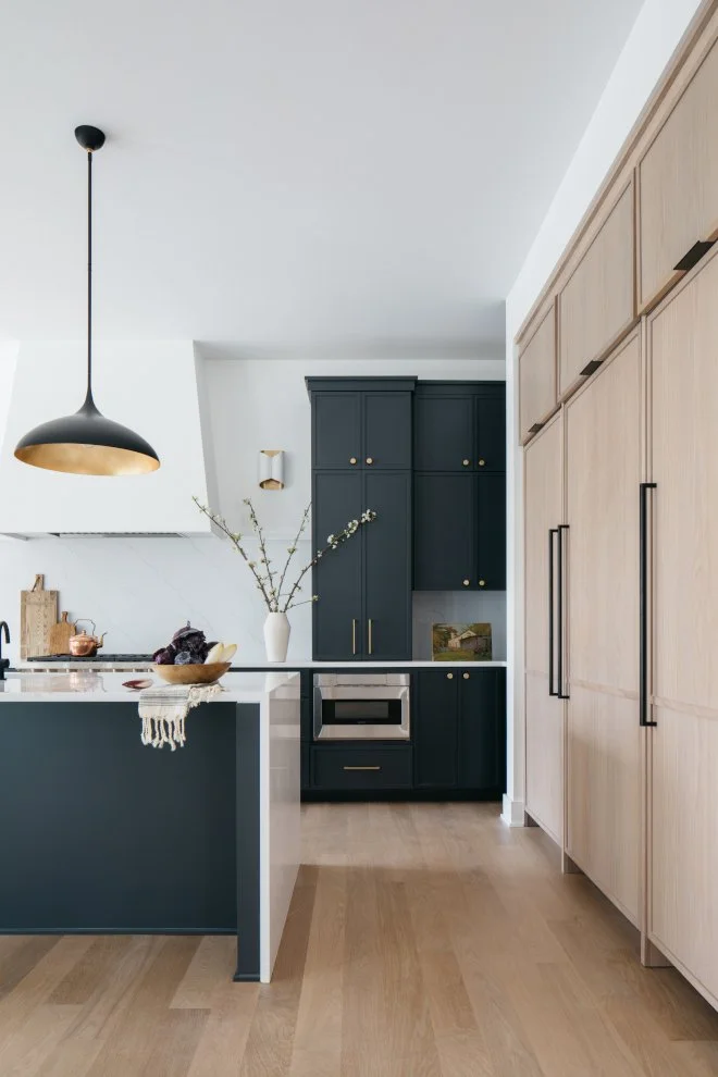
Don't let the unusual name put you off. Raccoon Fur is a beautiful, nearly black shade with blue undertones that give it a little more complexity than a traditional black.
Credit: Home Bunch
It's a striking choice for a kitchen, home office, powder room, or a space where you want to create a more intimate atmosphere. Paired with lighter furnishings, warm lighting, and natural textures, it can feel surprisingly inviting.
Charleston Brown HC-186 — Benjamin Moore
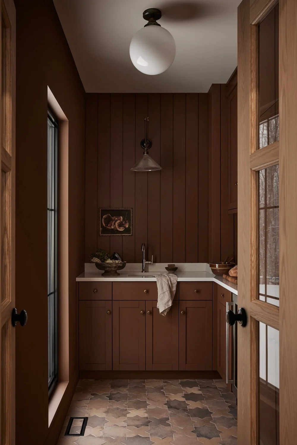
Brown is making its way back into interiors, and we're very much here for it. Charleston Brown is a rich, earthy shade that brings warmth and depth without relying on the usual beige or gray. It pairs beautifully with linen, leather, natural wood, and soft cream tones.
Credit: Blanc Marine
For anyone who loves a warm, layered interior, a deep brown can be a wonderful alternative to charcoal or black.
Gettysburgh Gold 1064 — Benjamin Moor
Not every moody paint colour needs to be dark green, navy, or brown. Gettysburgh Gold brings something a little different to the mix. This warm, earthy gold has a richness that feels particularly lovely alongside dark wood, vintage furniture, and natural materials.
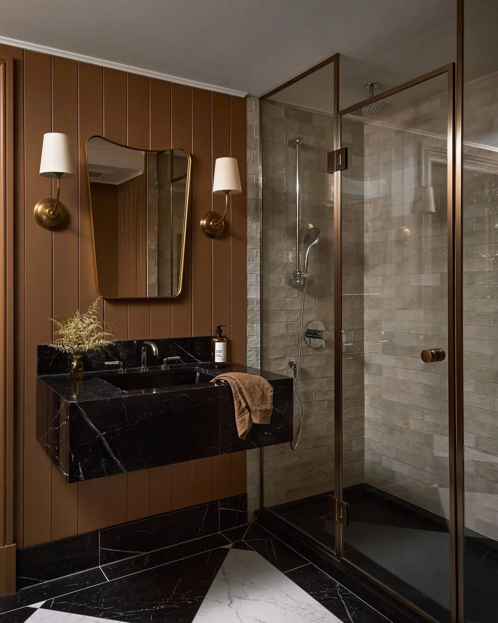
Credit: Blanc Marine
It's an interesting choice for a dining room, study, or any space that could benefit from a little warmth without introducing a particularly bright colour.
Creekside Green 2141-40 — Benjamin Moore
For those who prefer something a little softer, Creekside Green is a lovely alternative to the deeper shades on this list. With its muted green-gray appearance, it brings color into a room without overwhelming it.
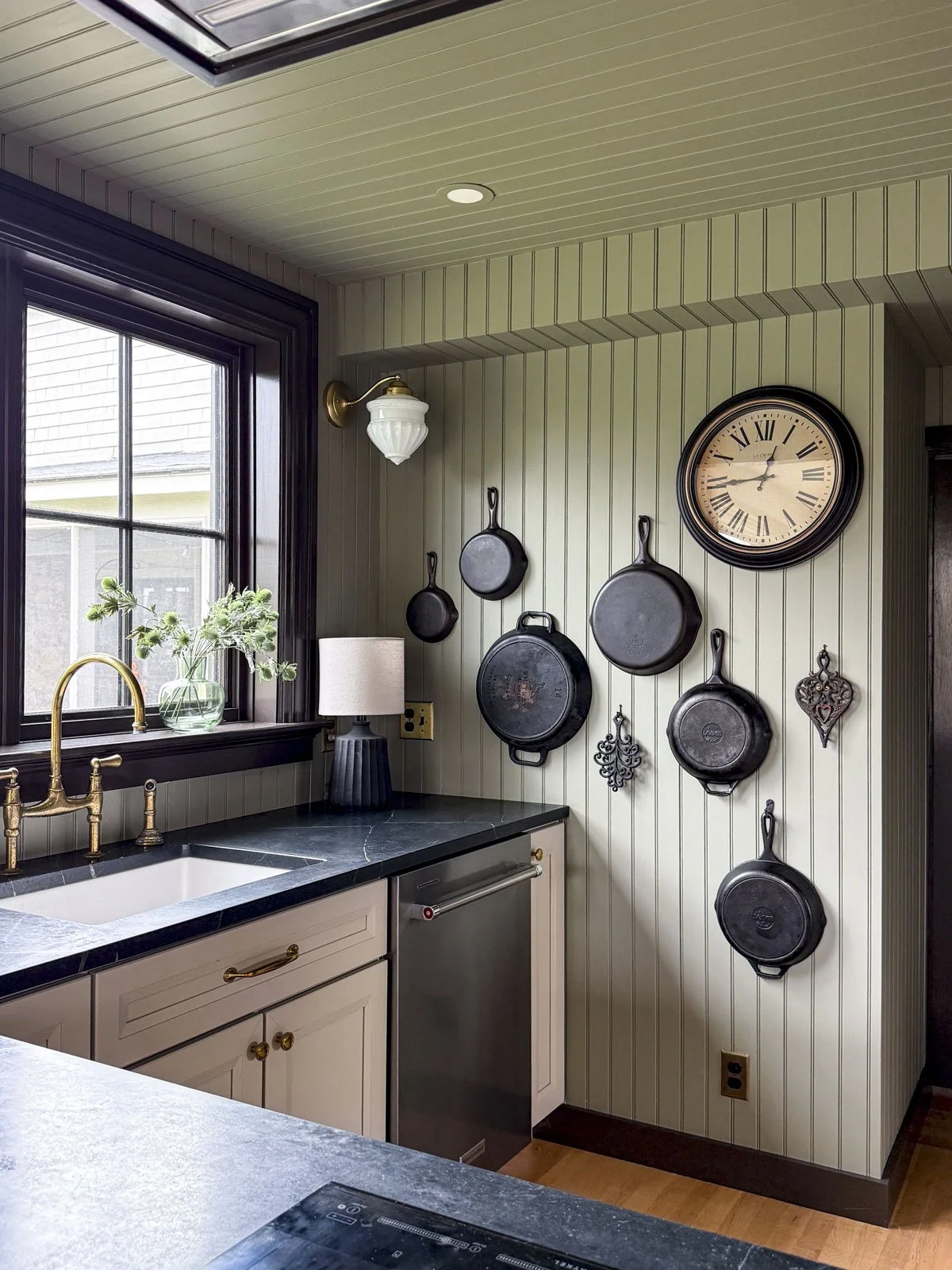
Credit: A Season for Home
It works beautifully with warm whites, natural stone, wood, and soft neutral furnishings. Consider it for a bedroom, bathroom, or quiet reading corner where you want a little colour while keeping the overall feel relaxed.
A Few Things to Consider Before Choosing a Dark Paint Color
One of the most important things to remember about paint is that it rarely looks exactly the same in every room.
Natural light, artificial lighting, flooring, furniture, and even the direction your windows face can all influence how a colour appears.
A deep green might look almost black in one room and noticeably greener in another. A warm brown can look richer in the evening than it does in bright afternoon light.
Before committing, bring samples home and look at them throughout the day. It's a simple step that can save you from choosing a colour that looks beautiful online but feels completely different in your own space.
Finding the Right Color for Your Home
The beauty of moody paint colours is that there's no single way to use them. You might love the idea of an entire room painted in a deep, rich shade, or perhaps you'd rather start with cabinetry, a built-in bookcase, or a smaller space like a powder room.
Whatever your preference, don't be afraid to explore something beyond the usual neutrals. Sometimes, a little more color is exactly what a room needs.
At Marianne Elizabeth Design, we love creating homes that feel warm, welcoming, and full of personality.
If you're planning a renovation or looking for help bringing your ideas together, we'd love to hear from you. Explore our work via the website or get in touch to discuss your project.