The Impact of Grout Colour
An often overlooked design element when tile is involved is the colour of the grout. This seems like a small detail, but with experience you learn that this small detail (as well as others) makes a big impact on the look of the space! Take a look at the photo below from Merola Tile- this is the same tile shown with four different colours of grout. They each look completely different!

Image via Merola Tile
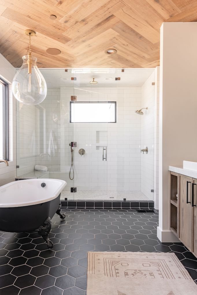
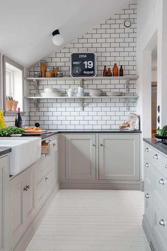
A dark grout colour with a light tile can make the tile more of a feature. The same applies for a dark tile with a light grout. It can “play up” the tile and make the pattern stand out, while a grout colour that doesn’t contrast with the tile as much will tone it down. A perk to dark grout is that it can hide stains and dirt, which is great for flooring especially. However, some people feel that a dark grout looks “dirty”, so it’s definitely a personal preference too! Below on the right is an example of dark grout with a light tile. You can see how the dark grout really helps the tile to pop and create a feature wall with the open shelving. It also helps to tie in the rest of the design, pairing well with the dark countertops.
On the left is an example of a dark floor tile that contrasts with the light grout. The floors really stand out since they aren't competing as much with the light tiles and light grout in the shower.
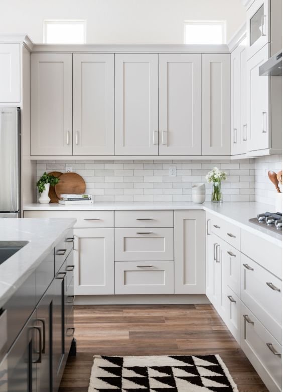
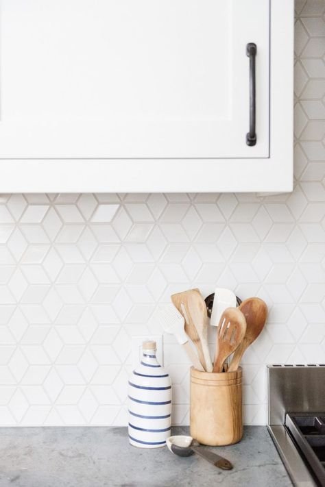
A light tile with light grout gives a softer look that can draw more attention to other design elements. It will make the shape of the tiles blend together more, rather than enhancing the shape of them. Below on the right is another example of grey cabinets with a light tile, except this one has a light grey grout that is close in colour to that of the tiles. It allows the variation in the tile to still be a statement, but in a more gentle way. This was a good choice in this kitchen, given that the floor is fairly busy with a lot of variation.
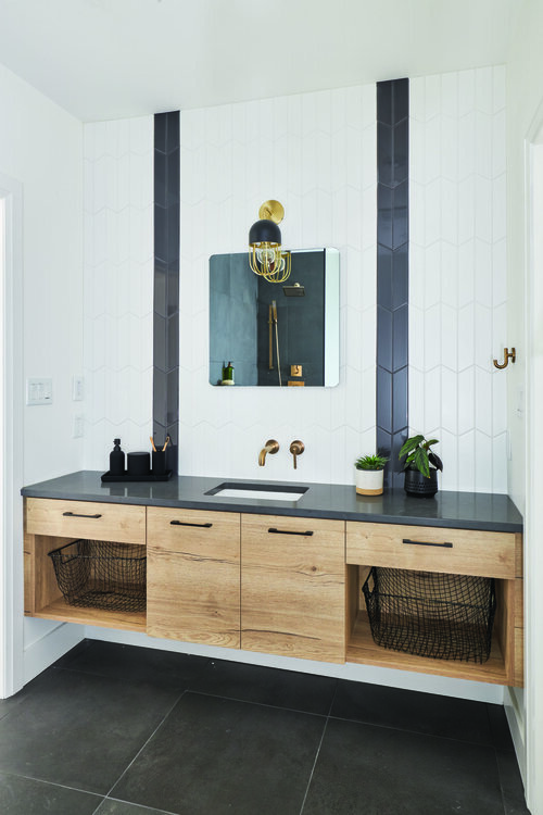
Shown on the left is another example of grout that is the same or close to the colour of the tile. This allows the black stripe created by the way the tile was laid to be the feature, rather than the shape of the tile itself. You can see also that the floor tile has a low-contrast grout.
Different grout colours can also change the style of the space. In general, grout that contrasts strongly with the tile tends to look more bold and contemporary, while a grout that is similar to the colour of the tile lends itself to a more transitional style. But there are exceptions of course that depend on the rest of the design! You can give a bold tile a softer look by choosing a grout the blends more with the tile, and vice-versa!
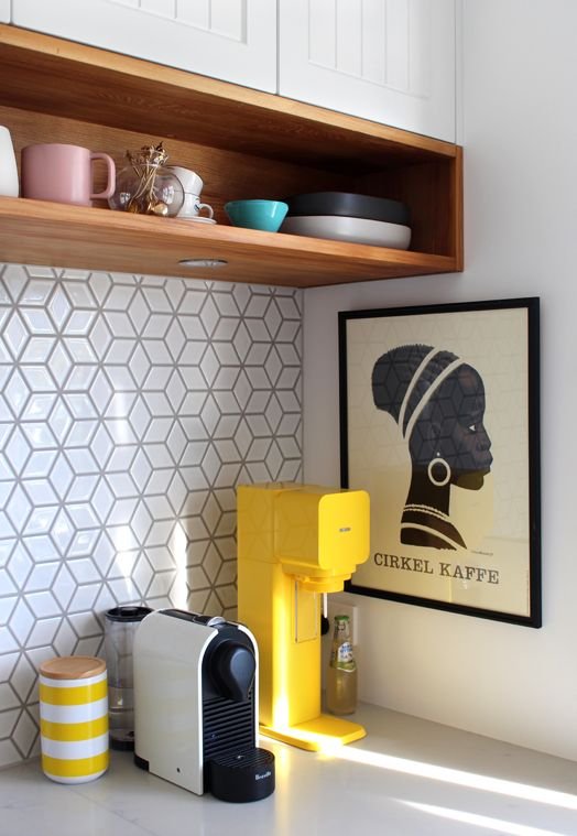
Shown below on the left is an example of a geometric tile with a light grey grout. If the grout had been dark grey or black, the overall look would have been much busier and bolder! This white tile with light grey grout provides a modern flare that’s a little more subtle.
Compare that to the image on the right, where the grout is a darker grey and looks more modern.
Shown below is a bathroom renovation we recently completed where we chose a light warm grey grout for all of the tile. This gave the bathroom a good flow and consistency and allowed a balance between bold but not too bold. We absolutely love how it turned out!

Our central Calgary main bathroom renovation
As I hope I’ve demonstrated in this blog post, grout colour is an important design element that impacts the overall design in a way most people don’t realize or think about! These small details can mean the difference between a space that makes you say “wow!” and a space that falls a little flat. A perk of hiring a designer is that we are aware of small details like this, and we’ll make sure the end result is amazing!