The Quiet Power of Pink
Pink is often misunderstood.
It’s frequently dismissed as sweet or juvenile, but in interiors, pink is far more versatile than many give it credit for. In February it’s everywhere. School spirit days, shop displays, flower bouquets in every grocery aisle. And yet inside a home, pink doesn’t have to feel seasonal. It can be confident, architectural, even refined.
A dusty blush can act almost like a neutral. A muted rose layered with oak, stone, or simple metal finishes feels composed rather than sugary. When pink leans away from candy tones and toward clay or plaster, it becomes something entirely different. It softens a space without making it feel overly delicate.
Even in practical spaces, pink proves its strength. A laundry room finished in pink cabinetry paired with crisp white countertops and patterned flooring has presence. In rooms that are often overlooked, pink adds dimension without overwhelming the eye.
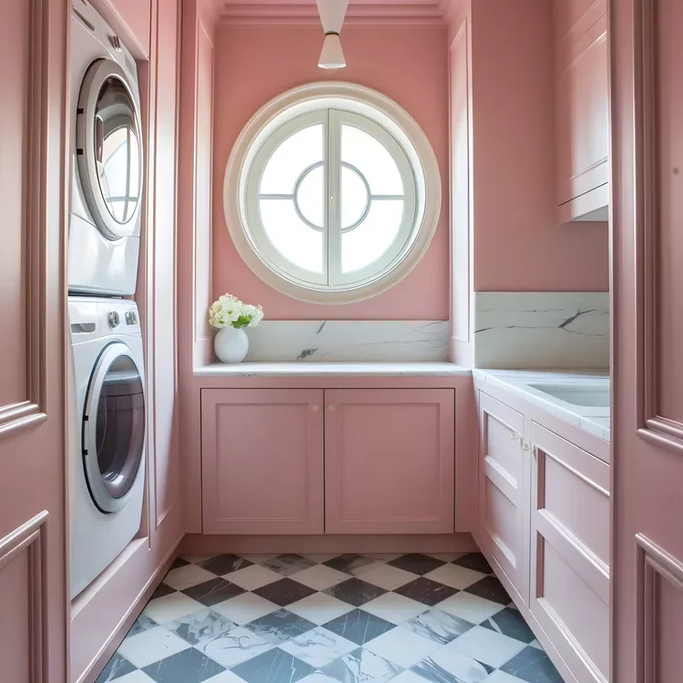
Credit: Brexton Cole Interiors
In kitchens, pink cabinetry or subtle pink finishes alongside wood surfaces and greenery create warmth without heaviness. Natural light enhances it. Instead of flattening under daylight, pink reflects warmth back into the space, working with the light rather than fighting it.
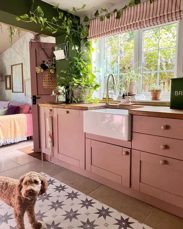
Credit: @the_koo_koo_nest_ / Instagram
Bathrooms are another example of pink functioning as material rather than decoration. Textured pink tiles paired with black fixtures and clean-lined hardware feel structured and modern. The contrast gives the colour depth. It reads strong, not fragile.
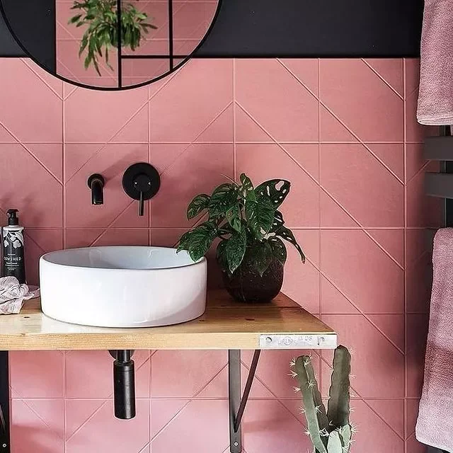
Credit: @83renovation / Instagram
And in bedrooms, pink used on walls or paneling becomes a backdrop for layered textiles and art. Combined with richer fabrics or darker accent tones, it feels cohesive and elegant. The result is a room that holds colour confidently rather than relying on it as novelty.
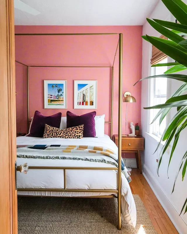
Credit: @imjessicabrigham / Instagram